
CT_SHORTCUTBUTTON
| Control Types / MACRO (TYPE VALUE) | |
|---|---|
| Text/Image/Video |
CT_STATIC (0) | CT_EDIT (2) | CT_HTML (9) | CT_STRUCTURED_TEXT (13) |
| Buttons |
CT_BUTTON (1) | CT_ACTIVETEXT (11) | CT_SHORTCUTBUTTON (16) | CT_CHECKBOX (77) | CT_XBUTTON (41) |
| Lists |
CT_COMBO (4) | CT_TOOLBOX (6) | CT_CHECKBOXES (7) | CT_TREE (12) | CT_CONTROLS_TABLE (19) | CT_XCOMBO (44) | CT_LISTBOX (5) | CT_LISTNBOX (102) | CT_LISTNBOX_CHECKABLE (104) | CT_XLISTBOX (45) |
| 3D Objects |
CT_OBJECT (80) | CT_OBJECT_ZOOM (81) | CT_OBJECT_CONTAINER (82) | CT_OBJECT_CONT_ANIM (83) |
| Maps |
CT_MAP (100) | CT_MAP_MAIN (101) |
| Meta |
CT_SLIDER (3) | CT_XSLIDER (43) | CT_PROGRESS (8) | CT_CONTROLS_GROUP (15) | CT_WEBBROWSER (106) | CT_EXTENSION (107) |
| Menu |
CT_CONTEXT_MENU (14) | CT_MENU (46) | CT_MENU_STRIP (47) |
| Unknown |
CT_STATIC_SKEW (10) | CT_HITZONES (17) | CT_VEHICLETOGGLES (18) | CT_XKEYDESC (40) | CT_ANIMATED_TEXTURE (45) | CT_LINEBREAK (98) | CT_USER (99) | CT_ITEMSLOT (103) | CT_VEHICLE_DIRECTION (105) |
Introduction
A more customizable and modern version of CT_BUTTON that also supports Structured Text and an image with text at the same time (see below).
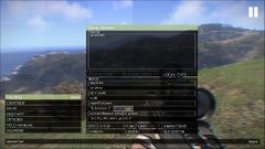
The escape menu with shortcutbuttons in the bottom left.
ShortcutButton with the steam logo (texture) and text.
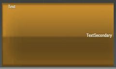
ShortcutButton with secondary text.

Image and text on the same button.


Related commands & functions
Related User Interface Eventhandlers
Alphabetical Order
#define CT_SHORTCUTBUTTON 16
A
action
- Type
- String
- Description
- SQS code executed when button is clicked.
action = "if (profilenamespace getvariable ['BIS_fnc_init_recompileEditor',false]) then {[1] call (uinamespace getvariable 'BIS_fnc_recompile')}";
animTextureDefault
- Type
- String
- Description
- n/a
animTextureDefault = "\A3\ui_f\data\GUI\RscCommon\RscShortcutButton\normal_ca.paa";
animTextureDisabled
- Type
- String
- Description
- n/a
animTextureDisabled = "\A3\ui_f\data\GUI\RscCommon\RscShortcutButton\normal_ca.paa";
animTextureFocused
- Type
- String
- Description
- n/a
animTextureFocused = "#(argb,8,8,3)color(1,1,1,1)";
animTextureNormal
- Type
- String
- Description
- n/a
animTextureNormal = "#(argb,8,8,3)color(1,1,1,1)";
animTextureOver
- Type
- String
- Description
- n/a
animTextureOver = "#(argb,8,8,3)color(1,1,1,1)";
animTexturePressed
- Type
- String
- Description
- n/a
animTexturePressed = "#(argb,8,8,3)color(1,1,1,1)";
Attributes
- Type
- Class
- Description
- Attributes of the text (Only 'font' has effect). See Structured Text control text attributes.
class Attributes
{
	font = "PuristaLight";
	color = "#E5E5E5";
	align = "left";
	shadow = "false";
};
AttributesImage
- Type
- Class
- Description
- n/a
class AttributesImage
{
	font = "RobotoCondensed";
	color = "#E5E5E5";
	align = "left";
};
autoAdjustTexture
- Type
- Boolean
- Description
- Introduced with
 2.10. Default: false. When this attribute set to true the texture will be rendered in the following way:
- If the original texture aspect ratio is 2:1 or more (w >= 2 * h) and the button aspect ration is 2:1 or more (w >= 2 * h), the corners of the texture are preserved (rounded corners would scale but not stretch).
- In all other cases the texture is stretched to cover the button.
autoAdjustTexture = true;
C
color
- Type
- Array
- Description
- Text color.
color[] = {1,1,1,1};
color2
- Type
- Array
- Description
- When hovering over the button the text color changes from color[] to color2[].
color2[] = {0.95,0.95,0.95,1};
color2Secondary
- Type
- Array
- Description
- n/a
color2Secondary[] = {0,0,0,1};
colorBackground2
- Type
- Array
- Description
- When hovering over the button the background color changes from colorBackground[] to colorBackground2[].
colorBackground2[] = {1,1,1,1};
colorBackgroundActive
- Type
- Array
- Description
- n/a
colorBackgroundActive[] = {"(profilenamespace getvariable ['GUI_BCG_RGB_R',0.77])","(profilenamespace getvariable ['GUI_BCG_RGB_G',0.51])","(profilenamespace getvariable ['GUI_BCG_RGB_B',0.08])",1};
colorBackgroundFocused
- Type
- Array
- Description
- Color of the background when the control is focused.
colorBackgroundFocused[] = {1,1,1,1};
colorDisabledSecondary
- Type
- Array
- Description
- n/a
colorDisabledSecondary[] = {1,1,1,0.25};
colorFocused
- Type
- Array
- Description
- Text color when the control is focused.
colorFocused[] = {0,0,0,1};
colorFocusedSecondary
- Type
- Array
- Description
- n/a
colorFocusedSecondary[] = {0,0,0,1};
colorSecondary
- Type
- Array
- Description
- n/a
colorSecondary[] = {1,1,1,1};
D
default
- Type
- Number
- Description
- If set to 1, this control is focused when the GUI is opened.
default = 1;
F
fontSecondary
- Type
- String
- Description
- n/a
fontSecondary = "PuristaLight";
H
HitZone
- Type
- Class
- Description
- n/a
class HitZone
{
	left = 0;
	top = 0;
	right = 0;
	bottom = 0;
};
K
KeyHints
- Type
- Class
- Description
- n/a
class KeyHints
{
	class A
	{
		key = "0x00050000 + 0";
		hint = "";
	};
};
P
period
- Type
- Number
- Description
- Blinking period.
period = 1.2;
periodFocus
- Type
- Number
- Description
- Blinking period when focused.
periodFocus = 1.2;
periodOver
- Type
- Number
- Description
- Blinking period when mouse is hovering over the button.
periodOver = 1.2;
S
ShortcutPos
- Type
- Class
- Description
- Position of the texture used on the button.
class ShortcutPos
{
	left = "5.25 * (((safezoneW / safezoneH) min 1.2) / 40)";
	top = 0;
	w = "1 * (((safezoneW / safezoneH) min 1.2) / 40)";
	h = "1 * ((((safezoneW / safezoneH) min 1.2) / 1.2) / 25)";
};
shortcuts
- Type
- Array
- Description
- Key shortcuts. often over-ridden/ignored by engine.
shortcuts[] = {"0x00050000 + 1"};
shpw
- Type
- Number
- Description
- Typo for show. See common attributes.
shpw = 0;
sizeExSecondary
- Type
- String
- Description
- n/a
sizeExSecondary = "(((((safezoneW / safezoneH) min 1.2) / 1.2) / 25) * 1)";
soundClick
- Type
- Array
- Description
- n/a
soundClick[] = {"\A3\ui_f\data\sound\RscButtonMenu\soundClick",0.09,1};
soundEnter
- Type
- Array
- Description
- n/a
soundEnter[] = {"\A3\ui_f\data\sound\RscButtonMenu\soundEnter",0.09,1};
soundEscape
- Type
- Array
- Description
- n/a
soundEscape[] = {"\A3\ui_f\data\sound\RscButtonMenu\soundEscape",0.09,1};
soundPush
- Type
- Array
- Description
- n/a
soundPush[] = {"\A3\ui_f\data\sound\RscButton\soundPush",0.09,1};
T
TextPos
- Type
- Class
- Description
- Position of the text. Useful for aligning with ShortcutPos.
class TextPos
{
	left = 0;
	top = "(1*(safezoneH / 40) - (0.028*SafezoneH)) / 2";
	right = 0.005;
	bottom = 0;
	forceMiddle = true; // Since Arma 3 v2.10, default false. When true, text will be forced in the middle of the button vertically
};
textSecondary
- Type
- String
- Description
- Sets the secondary text of the button.
textSecondary = "";
textureNoShortcut
- Type
- String
- Description
- A custom Texture to be displayed alongside text. Position can be set in the ShortcutPos (texture) and TextPos (text) class.
textureNoShortcut = "#(argb,8,8,3)color(0,0,0,0)";
U
url
- Type
- String
- Description
- Link to open when clicked.
url = "https://steamcommunity.com/workshop/browse?appid=107410";
Default Classes
RscShortcutButton
An older version of the shortcut button.
class RscShortcutButton
{
	deletable = 0;
	fade = 0;
	type = CT_SHORTCUTBUTTON;
	x = 0.1;
	y = 0.1;
	class HitZone
	{
		left = 0;
		top = 0;
		right = 0;
		bottom = 0;
	};
	class ShortcutPos
	{
		left = 0;
		top = ((GUI_GRID_HAbs / 20) - GUI_TEXT_SIZE_MEDIUM) / 2;
		w = GUI_TEXT_SIZE_MEDIUM * (3/4);
		h = GUI_TEXT_SIZE_MEDIUM;
	};
	class TextPos
	{
		left = GUI_TEXT_SIZE_MEDIUM * (3/4);
		top = ((GUI_GRID_HAbs / 20) - GUI_TEXT_SIZE_MEDIUM) / 2;
		right = 0.005;
		bottom = 0;
	};
	shortcuts[] = {};
	textureNoShortcut = "#(argb,8,8,3)color(0,0,0,0)";
	color[] = {1,1,1,1};
	colorFocused[] = {1,1,1,1};
	color2[] = {0.95,0.95,0.95,1};
	colorDisabled[] = {1,1,1,0.25};
	colorBackground[] =
	{
		"(profilenamespace getvariable ['GUI_BCG_RGB_R',0.13])",
		"(profilenamespace getvariable ['GUI_BCG_RGB_G',0.54])",
		"(profilenamespace getvariable ['GUI_BCG_RGB_B',0.21])",
		1
	};
	colorBackgroundFocused[] =
	{
		"(profilenamespace getvariable ['GUI_BCG_RGB_R',0.13])",
		"(profilenamespace getvariable ['GUI_BCG_RGB_G',0.54])",
		"(profilenamespace getvariable ['GUI_BCG_RGB_B',0.21])",
		1
	};
	colorBackground2[] = {1,1,1,1};
	soundEnter[] =
	{
		"\A3\ui_f\data\sound\RscButton\soundEnter",
		0.09,
		1
	};
	soundPush[] =
	{
		"\A3\ui_f\data\sound\RscButton\soundPush",
		0.09,
		1
	};
	soundClick[] =
	{
		"\A3\ui_f\data\sound\RscButton\soundClick",
		0.09,
		1
	};
	soundEscape[] =
	{
		"\A3\ui_f\data\sound\RscButton\soundEscape",
		0.09,
		1
	};
	class Attributes
	{
		font = "RobotoCondensed";
		color = "#E5E5E5";
		align = "left";
		shadow = "true";
	};
	idc = -1;
	style = ST_LEFT;
	default = 0;
	shadow = 1;
	w = 0.183825;
	h = (GUI_GRID_HAbs / 20);
	textSecondary = "";
	colorSecondary[] = {1,1,1,1};
	colorFocusedSecondary[] = {1,1,1,1};
	color2Secondary[] = {0.95,0.95,0.95,1};
	colorDisabledSecondary[] = {1,1,1,0.25};
	sizeExSecondary = GUI_TEXT_SIZE_MEDIUM;
	fontSecondary = "RobotoCondensed";
	animTextureDefault = "\A3\ui_f\data\GUI\RscCommon\RscShortcutButton\normal_ca.paa";
	animTextureNormal = "\A3\ui_f\data\GUI\RscCommon\RscShortcutButton\normal_ca.paa";
	animTextureDisabled = "\A3\ui_f\data\GUI\RscCommon\RscShortcutButton\normal_ca.paa";
	animTextureOver = "\A3\ui_f\data\GUI\RscCommon\RscShortcutButton\over_ca.paa";
	animTextureFocused = "\A3\ui_f\data\GUI\RscCommon\RscShortcutButton\focus_ca.paa";
	animTexturePressed = "\A3\ui_f\data\GUI\RscCommon\RscShortcutButton\down_ca.paa";
	periodFocus = 1.2;
	periodOver = 0.8;
	period = 0.4;
	font = "RobotoCondensed";
	size = GUI_TEXT_SIZE_MEDIUM;
	sizeEx = GUI_TEXT_SIZE_MEDIUM;
	text = "";
	url = "";
	action = "";
	class AttributesImage
	{
		font = "RobotoCondensed";
		color = "#E5E5E5";
		align = "left";
	};
};
RscButtonMenu
The modern Arma 3 button like the ones in the escape display.
class RscButtonMenu : RscShortcutButton
{
	idc = -1;
	type = CT_SHORTCUTBUTTON;
	style = ST_CENTER + ST_FRAME + ST_HUD_BACKGROUND;
	default = 0;
	shadow = 0;
	x = 0;
	y = 0;
	w = 0.095589;
	h = 0.039216;
	animTextureNormal = "#(argb,8,8,3)color(1,1,1,1)";
	animTextureDisabled = "#(argb,8,8,3)color(1,1,1,1)";
	animTextureOver = "#(argb,8,8,3)color(1,1,1,1)";
	animTextureFocused = "#(argb,8,8,3)color(1,1,1,1)";
	animTexturePressed = "#(argb,8,8,3)color(1,1,1,1)";
	animTextureDefault = "#(argb,8,8,3)color(1,1,1,1)";
	colorBackground[] = {0,0,0,0.8};
	colorBackgroundFocused[] = {1,1,1,1};
	colorBackground2[] = {0.75,0.75,0.75,1};
	color[] = {1,1,1,1};
	colorFocused[] = {0,0,0,1};
	color2[] = {0,0,0,1};
	colorText[] = {1,1,1,1};
	colorDisabled[] = {1,1,1,0.25};
	textSecondary = "";
	colorSecondary[] = {1,1,1,1};
	colorFocusedSecondary[] = {0,0,0,1};
	color2Secondary[] = {0,0,0,1};
	colorDisabledSecondary[] = {1,1,1,0.25};
	sizeExSecondary = GUI_TEXT_SIZE_MEDIUM;
	fontSecondary = "PuristaLight";
	period = 1.2;
	periodFocus = 1.2;
	periodOver = 1.2;
	size = GUI_TEXT_SIZE_MEDIUM;
	sizeEx = GUI_TEXT_SIZE_MEDIUM;
	tooltipColorText[] = {1,1,1,1};
	tooltipColorBox[] = {1,1,1,1};
	tooltipColorShade[] = {0,0,0,0.65};
	class TextPos
	{
		left = 0.25 * GUI_GRID_W;
		top = (GUI_GRID_H - GUI_TEXT_SIZE_MEDIUM) / 2;
		right = 0.005;
		bottom = 0;
	};
	class Attributes
	{
		font = "PuristaLight";
		color = "#E5E5E5";
		align = "left";
		shadow = "false";
	};
	class ShortcutPos
	{
		left = 5.25 * GUI_GRID_W;
		top = 0;
		w = 1 * GUI_GRID_W;
		h = 1 * GUI_GRID_H;
	};
	soundEnter[] =
	{
		"\A3\ui_f\data\sound\RscButtonMenu\soundEnter",
		0.09,
		1
	};
	soundPush[] =
	{
		"\A3\ui_f\data\sound\RscButtonMenu\soundPush",
		0.09,
		1
	};
	soundClick[] =
	{
		"\A3\ui_f\data\sound\RscButtonMenu\soundClick",
		0.09,
		1
	};
	soundEscape[] =
	{
		"\A3\ui_f\data\sound\RscButtonMenu\soundEscape",
		0.09,
		1
	};
};
Other examples
This is an example with an image and text combined in one control.
class RscButtonMenuSteam : RscButtonMenu
{
	text = "STEAM";
	colorBackground[] = {0.03137255,0.72156864,0.91764706,1.0};
	textureNoShortcut = "\A3\Ui_f\data\GUI\RscCommon\RscButtonMenuSteam\steam_ca.paa";
	class TextPos
	{
		left = 0.0325;
		top = "(((((safezoneW / safezoneH) min 1.2) / 1.2) / 25) - (((((safezoneW / safezoneH) min 1.2) / 1.2) / 25) * 1)) / 2";
		right = 0.005;
		bottom = 0.0;
	};
	class ShortcutPos
	{
		left = 0.005;
		top = 0.005;
		w = 0.0225;
		h = 0.03;
	};
};