
CT_TOOLBOX
| Control Types / MACRO (TYPE VALUE) | |
|---|---|
| Text/Image/Video |
CT_STATIC (0) | CT_EDIT (2) | CT_HTML (9) | CT_STRUCTURED_TEXT (13) |
| Buttons |
CT_BUTTON (1) | CT_ACTIVETEXT (11) | CT_SHORTCUTBUTTON (16) | CT_CHECKBOX (77) | CT_XBUTTON (41) |
| Lists |
CT_COMBO (4) | CT_TOOLBOX (6) | CT_CHECKBOXES (7) | CT_TREE (12) | CT_CONTROLS_TABLE (19) | CT_XCOMBO (44) | CT_LISTBOX (5) | CT_LISTNBOX (102) | CT_LISTNBOX_CHECKABLE (104) | CT_XLISTBOX (45) |
| 3D Objects |
CT_OBJECT (80) | CT_OBJECT_ZOOM (81) | CT_OBJECT_CONTAINER (82) | CT_OBJECT_CONT_ANIM (83) |
| Maps |
CT_MAP (100) | CT_MAP_MAIN (101) |
| Meta |
CT_SLIDER (3) | CT_XSLIDER (43) | CT_PROGRESS (8) | CT_CONTROLS_GROUP (15) | CT_WEBBROWSER (106) | CT_EXTENSION (107) |
| Menu |
CT_CONTEXT_MENU (14) | CT_MENU (46) | CT_MENU_STRIP (47) |
| Unknown |
CT_STATIC_SKEW (10) | CT_HITZONES (17) | CT_VEHICLETOGGLES (18) | CT_XKEYDESC (40) | CT_ANIMATED_TEXTURE (45) | CT_LINEBREAK (98) | CT_USER (99) | CT_ITEMSLOT (103) | CT_VEHICLE_DIRECTION (105) |
Introduction
A Toolbox is a set of options, ordered by columns and rows. Only one can be active at a time and one is always selected (the first one by default). For Toolbox with multiple selections see CT_CHECKBOXES.
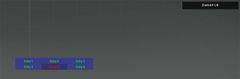
A CT_TOOLBOX control with the 5th entry selected.
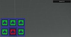
The toolbox can be set to display images instead too.


Related commands & functions
Related User Interface Eventhandlers
Alphabetical Order
#define CT_TOOLBOX 6
C
checked_strings
- Type
- Array
- Description
- Options texts to display when an option is selected.
checked_strings[] = {"[Entry 1]","[Entry 2]","[Entry 3]","[Entry 4]","[Entry 5]","[Entry 6]"};
color
- Type
- Array
- Description
- n/a
color[] = {0.95,0.95,0.95,1};
colorBackground
- Type
- Array
- Description
- Color of the background when option is not selected.
colorBackground[] = {0.95,0.95,0.95,1};
colorDisable
- Type
- Array
- Description
- n/a
colorDisable[] = {0,0,0,0};
colorSelect
- Type
- Array
- Description
- n/a
colorSelect[] = {0.95,0.95,0.95,1};
colorSelectedBg
- Type
- Array
- Description
- Color of the background when option is selected.
colorSelectedBg[] = {"(profilenamespace getvariable ['GUI_BCG_RGB_R',0.13])","(profilenamespace getvariable ['GUI_BCG_RGB_G',0.54])","(profilenamespace getvariable ['GUI_BCG_RGB_B',0.21])",0.5};
colorTextDisable
- Type
- Array
- Description
- n/a
colorTextDisable[] = {0.4,0.4,0.4,1};
colorTextSelect
- Type
- Array
- Description
- Color of the selected option text.
colorTextSelect[] = {1,1,1,1};
columns
Number example:
columns = 3;
String example:
columns = "4 - 1";
N
names
- Type
- Array
- Description
- n/a
names[] = {"MOVE","GETOUT","UNLOAD","TR UNLOAD","%1/cfgWaypoints/A3/Land","%1/cfgWaypoints/A3/Artillery","UNHOOK"};
R
rows
- Type
- Number
- Description
- Amount of rows to arrange options into.
rows = 2;
S
strings
- Type
- Array
- Description
- Options texts to display.
strings[] = {"100m","200m","500m"};
T
tooltips
- Type
- Array
- Description
- Tooltips for each option.
tooltips[] = {"Objects","Compositions","Triggers","Systems","Markers"};
V
values
- Type
- Array
- Description
- Numerical values associated with items. Can be retrieved or set with lbValue and lbSetValue.
values[] = {0,1,2,3,4,5,6};
Default Classes
RscExample
class RscToolbox
{
	deletable = 0;
	fade = 0;
	access = 0;
	type = CT_TOOLBOX;
	style = ST_CENTER;
	colorText[] = {0.95,0.95,0.95,1};
	color[] = {0.95,0.95,0.95,1};
	colorTextSelect[] = {0.95,0.95,0.95,1};
	colorSelect[] = {0.95,0.95,0.95,1};
	colorTextDisable[] = {0.4,0.4,0.4,1};
	colorDisable[] = {0.4,0.4,0.4,1};
	colorSelectedBg[] =
	{
		"(profilenamespace getvariable ['GUI_BCG_RGB_R',0.13])",
		"(profilenamespace getvariable ['GUI_BCG_RGB_G',0.54])",
		"(profilenamespace getvariable ['GUI_BCG_RGB_B',0.21])",
		0.5
	};
	shadow = 0;
	strings[] =
	{
		"",
		""
	};
	x = 0;
	y = 0;
	w = 0.3;
	h = 0.025;
	rows = 1;
	columns = 2;
	font = "RobotoCondensed";
	sizeEx = GUI_TEXT_SIZE_SMALL;
};