
CT CONTROLS TABLE: Difference between revisions
Lou Montana (talk | contribs) m (Text replacement - " ( *class [a-zA-Z0-9_]+): *([a-zA-Z0-9_]+ *) " to " $1 : $2 ") |
Lou Montana (talk | contribs) m (Some wiki formatting) |
||
| Line 3: | Line 3: | ||
|macro = CT_CONTROLS_TABLE | |macro = CT_CONTROLS_TABLE | ||
|value = 19 | |value = 19 | ||
|description = | |description = | ||
This control type is a crossover between [[CT_LISTNBOX]] and [[CT_CONTROLS_GROUP]]. It is a list of user defined controls. | This control type is a crossover between [[CT_LISTNBOX]] and [[CT_CONTROLS_GROUP]]. It is a list of user defined controls. | ||
=== Rows and headers === | === Rows and headers === | ||
| Line 16: | Line 16: | ||
Structure of row and header is defined using a template. Apart from their names (RowTemplate and HeaderTemplate), structure of both templates is the same. Each defines a set of columns and their properties. The column class (the name of which is currently not used) defines key properties of control that is created upon creation of new row or header. | Structure of row and header is defined using a template. Apart from their names (RowTemplate and HeaderTemplate), structure of both templates is the same. Each defines a set of columns and their properties. The column class (the name of which is currently not used) defines key properties of control that is created upon creation of new row or header. | ||
'''controlBaseClassPath''' - Defines config path to control. See next section for detailed info. | * '''controlBaseClassPath''' - Defines config path to control. See next section for detailed info. | ||
'''columnX''' - Position of the created control, in table coordinates (0 is the table's left side). | * '''columnX''' - Position of the created control, in table coordinates (0 is the table's left side). | ||
'''columnW''' - Width of the created control. UI element created inside the column will be as wide as the column is. | * '''columnW''' - Width of the created control. UI element created inside the column will be as wide as the column is. | ||
'''controlOffsetY''' - Optional, default value 0. Defines offset of control from top of its line. Negative values are ignored. | * '''controlOffsetY''' - Optional, default value 0. Defines offset of control from top of its line. Negative values are ignored. | ||
'''controlH''' - Optional, default value 0. If set to non-negative value, it overrides height of the control from base class. Otherwise, the height from control base class is used. | * '''controlH''' - Optional, default value 0. If set to non-negative value, it overrides height of the control from base class. Otherwise, the height from control base class is used. | ||
It is important to note that even if a Controls Table uses only rows or only headers, both templates must be defined in config. | It is important to note that even if a Controls Table uses only rows or only headers, both templates must be defined in config. | ||
| Line 27: | Line 27: | ||
Each column must have its base class defined by the controlBaseClassPath[] parameter. This array of strings defines config path to class that is instantiated each time a new row (or header) is added to the table. The given class must be a valid UI control, i.e. it must contain parameter type that has a valid value and any other parameters that correspond to the given type. | Each column must have its base class defined by the controlBaseClassPath[] parameter. This array of strings defines config path to class that is instantiated each time a new row (or header) is added to the table. The given class must be a valid UI control, i.e. it must contain parameter type that has a valid value and any other parameters that correspond to the given type. | ||
<syntaxhighlight lang="cpp"> | |||
controlBaseClassPath[] = { "RscDisplayTemp", "RscDisplayTemp_LineTextBase" }; | |||
</syntaxhighlight> | |||
Expands to config path: | Expands to config path: | ||
<sqf> | |||
configFile >> "RscDisplayTemp" >> "RscDisplayTemp_LineTextBase"; | |||
// or | |||
missionConfigFile >> "RscDisplayTemp" >> "RscDisplayTemp_LineTextBase"; // since {{arma3}} v2.02 | |||
// or | |||
campaignConfigFile >> "RscDisplayTemp" >> "RscDisplayTemp_LineTextBase"; // since {{arma3}} v2.02 | |||
</sqf> | |||
=== White list === | === White list === | ||
| Line 37: | Line 44: | ||
Some control types are not suitable for use inside of Controls Table. These include e.g. control containers (Controls Group and Controls Table) or controls that exceed their defined bounds while being drawn (Combo box). For this reason, the Controls Table only supports limited subset of UI controls that have been tested and confirmed to work. | Some control types are not suitable for use inside of Controls Table. These include e.g. control containers (Controls Group and Controls Table) or controls that exceed their defined bounds while being drawn (Combo box). For this reason, the Controls Table only supports limited subset of UI controls that have been tested and confirmed to work. | ||
The currently supported types are: | The currently supported types are: | ||
'''CT_STATIC''' | {{Columns|2| | ||
'''CT_BUTTON''' | * '''CT_STATIC''' | ||
'''CT_EDIT''' | * '''CT_BUTTON''' | ||
'''CT_ACTIVETEXT''' | * '''CT_EDIT''' | ||
'''CT_STRUCTURED_TEXT''' | * '''CT_ACTIVETEXT''' | ||
'''CT_SHORTCUTBUTTON''' | * '''CT_STRUCTURED_TEXT''' | ||
'''CT_XSLIDER''' | * '''CT_SHORTCUTBUTTON''' | ||
'''CT_CHECKBOX''' | * '''CT_XSLIDER''' | ||
* '''CT_CHECKBOX''' | |||
}} | |||
=== IDC pool === | === IDC pool === | ||
| Line 58: | Line 67: | ||
If table A contains 50 headers and 83 rows, it is using 299 IDCs and no additional row can be created. However, it is still possible to add one more header. | If table A contains 50 headers and 83 rows, it is using 299 IDCs and no additional row can be created. However, it is still possible to add one more header. | ||
{{Feature|informative|Currently, the system does not check if there is any other control, the IDC of which lies in the range.}} | |||
=== Draw order === | === Draw order === | ||
| Line 71: | Line 80: | ||
|gallery=File:A3 ControlsTable.jpg{{!}}[[CT_CONTROLS_TABLE]] control. | |gallery=File:A3 ControlsTable.jpg{{!}}[[CT_CONTROLS_TABLE]] control. | ||
|commands = | |commands = | ||
* [[:Category: | * [[:Category:Command Group: GUI Control - Controls Table|Commands: Controls Table]] | ||
|events = | |events = | ||
}} | }} | ||
| Line 101: | Line 110: | ||
class HeaderBackground | class HeaderBackground | ||
{ | { | ||
controlBaseClassPath[] = {"RscText"}; | controlBaseClassPath[] = { "RscText" }; | ||
columnX = 0; | columnX = 0; | ||
columnW = 14.7 * GUI_GRID_W; | columnW = 14.7 * GUI_GRID_W; | ||
| Line 108: | Line 117: | ||
class Column1 | class Column1 | ||
{ | { | ||
controlBaseClassPath[] = {"RscPictureKeepAspect"}; | controlBaseClassPath[] = { "RscPictureKeepAspect" }; | ||
columnX = 0.2 * GUI_GRID_W; | columnX = 0.2 * GUI_GRID_W; | ||
columnW = 0.6 * GUI_GRID_W; | columnW = 0.6 * GUI_GRID_W; | ||
| Line 116: | Line 125: | ||
class Column2 | class Column2 | ||
{ | { | ||
controlBaseClassPath[] = {"RscText"}; | controlBaseClassPath[] = { "RscText" }; | ||
columnX = 0.8 * GUI_GRID_W; | columnX = 0.8 * GUI_GRID_W; | ||
columnW = 9 * GUI_GRID_W; | columnW = 9 * GUI_GRID_W; | ||
| Line 159: | Line 168: | ||
class RowBackground | class RowBackground | ||
{ | { | ||
controlBaseClassPath[] = {"RscText"}; | controlBaseClassPath[] = { "RscText" }; | ||
columnX = 0; | columnX = 0; | ||
columnW = 14.7 * GUI_GRID_W; | columnW = 14.7 * GUI_GRID_W; | ||
| Line 166: | Line 175: | ||
class Column1 | class Column1 | ||
{ | { | ||
controlBaseClassPath[] = {"RscPictureKeepAspect"}; | controlBaseClassPath[] = { "RscPictureKeepAspect" }; | ||
columnX = 0; | columnX = 0; | ||
columnW = 2 * GUI_GRID_W; | columnW = 2 * GUI_GRID_W; | ||
| Line 174: | Line 183: | ||
class Column2 | class Column2 | ||
{ | { | ||
controlBaseClassPath[] = {"RscText"}; | controlBaseClassPath[] = { "RscText" }; | ||
columnX = 2 * GUI_GRID_W; | columnX = 2 * GUI_GRID_W; | ||
columnW = 8.7 * GUI_GRID_W; | columnW = 8.7 * GUI_GRID_W; | ||
| Line 181: | Line 190: | ||
class Column3 | class Column3 | ||
{ | { | ||
controlBaseClassPath[] = {"RscButton"}; | controlBaseClassPath[] = { "RscButton" }; | ||
columnX = 11.2 * GUI_GRID_W; | columnX = 11.2 * GUI_GRID_W; | ||
columnW = 2 * GUI_GRID_W; | columnW = 2 * GUI_GRID_W; | ||
| Line 224: | Line 233: | ||
w = 15 * GUI_GRID_W; | w = 15 * GUI_GRID_W; | ||
h = 20 * GUI_GRID_H; | h = 20 * GUI_GRID_H; | ||
type = CT_CONTROLS_TABLE; | type = CT_CONTROLS_TABLE; | ||
style = SL_TEXTURES; | style = SL_TEXTURES; | ||
lineSpacing = 0; | lineSpacing = 0; | ||
rowHeight = 1 * GUI_GRID_H; | rowHeight = 1 * GUI_GRID_H; | ||
headerHeight = 1 * GUI_GRID_H; | headerHeight = 1 * GUI_GRID_H; | ||
firstIDC = 42000; | firstIDC = 42000; | ||
lastIDC = 44999; | lastIDC = 44999; | ||
// Colours which are used for animation (i.e. change of colour) of the selected line. | // Colours which are used for animation (i.e. change of colour) of the selected line. | ||
selectedRowColorFrom[] = {0.7, 0.85, 1, 0.25}; | selectedRowColorFrom[] = { 0.7, 0.85, 1, 0.25 }; | ||
selectedRowColorTo[] = {0.7, 0.85, 1, 0.5}; | selectedRowColorTo[] = { 0.7, 0.85, 1, 0.5 }; | ||
// Length of the animation cycle in seconds. | // Length of the animation cycle in seconds. | ||
selectedRowAnimLength = 1.2; | selectedRowAnimLength = 1.2; | ||
class VScrollBar : ScrollBar | class VScrollBar : ScrollBar | ||
{ | { | ||
| Line 249: | Line 258: | ||
autoScrollSpeed = 1; | autoScrollSpeed = 1; | ||
}; | }; | ||
class HScrollBar : ScrollBar | class HScrollBar : ScrollBar | ||
{ | { | ||
height = 0.028; | height = 0.028; | ||
}; | }; | ||
// Template for selectable rows | // Template for selectable rows | ||
class RowTemplate | class RowTemplate | ||
| Line 260: | Line 269: | ||
class RowBackground | class RowBackground | ||
{ | { | ||
controlBaseClassPath[] = {"RscText"}; | controlBaseClassPath[] = { "RscText" }; | ||
columnX = 0; | columnX = 0; | ||
columnW = 14.7 * GUI_GRID_W; | columnW = 14.7 * GUI_GRID_W; | ||
| Line 267: | Line 276: | ||
class Column1 | class Column1 | ||
{ | { | ||
controlBaseClassPath[] = {"RscPictureKeepAspect"}; | controlBaseClassPath[] = { "RscPictureKeepAspect" }; | ||
columnX = 0; | columnX = 0; | ||
columnW = 2 * GUI_GRID_W; | columnW = 2 * GUI_GRID_W; | ||
| Line 275: | Line 284: | ||
class Column2 | class Column2 | ||
{ | { | ||
controlBaseClassPath[] = {"RscText"}; | controlBaseClassPath[] = { "RscText" }; | ||
columnX = 2 * GUI_GRID_W; | columnX = 2 * GUI_GRID_W; | ||
columnW = 8.7 * GUI_GRID_W; | columnW = 8.7 * GUI_GRID_W; | ||
| Line 282: | Line 291: | ||
class Column3 | class Column3 | ||
{ | { | ||
controlBaseClassPath[] = {"RscButton"}; | controlBaseClassPath[] = { "RscButton" }; | ||
columnX = 11.2 * GUI_GRID_W; | columnX = 11.2 * GUI_GRID_W; | ||
columnW = 2 * GUI_GRID_W; | columnW = 2 * GUI_GRID_W; | ||
| Line 288: | Line 297: | ||
}; | }; | ||
}; | }; | ||
// Template for headers (unlike rows, cannot be selected) | // Template for headers (unlike rows, cannot be selected) | ||
class HeaderTemplate | class HeaderTemplate | ||
| Line 294: | Line 303: | ||
class HeaderBackground | class HeaderBackground | ||
{ | { | ||
controlBaseClassPath[] = {"RscText"}; | controlBaseClassPath[] = { "RscText" }; | ||
columnX = 0; | columnX = 0; | ||
columnW = 14.7 * GUI_GRID_W; | columnW = 14.7 * GUI_GRID_W; | ||
| Line 301: | Line 310: | ||
class Column1 | class Column1 | ||
{ | { | ||
controlBaseClassPath[] = {"RscPictureKeepAspect"}; | controlBaseClassPath[] = { "RscPictureKeepAspect" }; | ||
columnX = 0.2 * GUI_GRID_W; | columnX = 0.2 * GUI_GRID_W; | ||
columnW = 0.6 * GUI_GRID_W; | columnW = 0.6 * GUI_GRID_W; | ||
| Line 309: | Line 318: | ||
class Column2 | class Column2 | ||
{ | { | ||
controlBaseClassPath[] = {"RscText"}; | controlBaseClassPath[] = { "RscText" }; | ||
columnX = 0.8 * GUI_GRID_W; | columnX = 0.8 * GUI_GRID_W; | ||
columnW = 9 * GUI_GRID_W; | columnW = 9 * GUI_GRID_W; | ||
Latest revision as of 12:16, 15 December 2025
| Control Types / MACRO (TYPE VALUE) | |
|---|---|
| Text/Image/Video |
CT_STATIC (0) | CT_EDIT (2) | CT_HTML (9) | CT_STRUCTURED_TEXT (13) |
| Buttons |
CT_BUTTON (1) | CT_ACTIVETEXT (11) | CT_SHORTCUTBUTTON (16) | CT_CHECKBOX (77) | CT_XBUTTON (41) |
| Lists |
CT_COMBO (4) | CT_TOOLBOX (6) | CT_CHECKBOXES (7) | CT_TREE (12) | CT_CONTROLS_TABLE (19) | CT_XCOMBO (44) | CT_LISTBOX (5) | CT_LISTNBOX (102) | CT_LISTNBOX_CHECKABLE (104) | CT_XLISTBOX (45) |
| 3D Objects |
CT_OBJECT (80) | CT_OBJECT_ZOOM (81) | CT_OBJECT_CONTAINER (82) | CT_OBJECT_CONT_ANIM (83) |
| Maps |
CT_MAP (100) | CT_MAP_MAIN (101) |
| Meta |
CT_SLIDER (3) | CT_XSLIDER (43) | CT_PROGRESS (8) | CT_CONTROLS_GROUP (15) | CT_WEBBROWSER (106) | CT_EXTENSION (107) |
| Menu |
CT_CONTEXT_MENU (14) | CT_MENU (46) | CT_MENU_STRIP (47) |
| Unknown |
CT_STATIC_SKEW (10) | CT_HITZONES (17) | CT_VEHICLETOGGLES (18) | CT_XKEYDESC (40) | CT_ANIMATED_TEXTURE (45) | CT_LINEBREAK (98) | CT_USER (99) | CT_ITEMSLOT (103) | CT_VEHICLE_DIRECTION (105) |
Introduction
This control type is a crossover between CT_LISTNBOX and CT_CONTROLS_GROUP. It is a list of user defined controls.
Rows and headers
Each Controls Table consists of N lines, with each line being either row or header. Header is a collection of controls that are located on the same row. Row is similar to header, with added functionality of selection. If user clicks on a row or any control in it, the row is selected and highlighted. Up and down keys can be used to change selection to the previous or next row, respectively. When the selection is changed, the event onLBSelChanged is emitted. If the highlight colour is set to fully transparent, rows can act as another type of header as user does not perceive any selection.
Row and header templates
Structure of row and header is defined using a template. Apart from their names (RowTemplate and HeaderTemplate), structure of both templates is the same. Each defines a set of columns and their properties. The column class (the name of which is currently not used) defines key properties of control that is created upon creation of new row or header.
- controlBaseClassPath - Defines config path to control. See next section for detailed info.
- columnX - Position of the created control, in table coordinates (0 is the table's left side).
- columnW - Width of the created control. UI element created inside the column will be as wide as the column is.
- controlOffsetY - Optional, default value 0. Defines offset of control from top of its line. Negative values are ignored.
- controlH - Optional, default value 0. If set to non-negative value, it overrides height of the control from base class. Otherwise, the height from control base class is used.
It is important to note that even if a Controls Table uses only rows or only headers, both templates must be defined in config.
Base class
Each column must have its base class defined by the controlBaseClassPath[] parameter. This array of strings defines config path to class that is instantiated each time a new row (or header) is added to the table. The given class must be a valid UI control, i.e. it must contain parameter type that has a valid value and any other parameters that correspond to the given type.
controlBaseClassPath[] = { "RscDisplayTemp", "RscDisplayTemp_LineTextBase" };
Expands to config path:
White list
Some control types are not suitable for use inside of Controls Table. These include e.g. control containers (Controls Group and Controls Table) or controls that exceed their defined bounds while being drawn (Combo box). For this reason, the Controls Table only supports limited subset of UI controls that have been tested and confirmed to work.
The currently supported types are:
- CT_STATIC
- CT_BUTTON
- CT_EDIT
- CT_ACTIVETEXT
- CT_STRUCTURED_TEXT
- CT_SHORTCUTBUTTON
- CT_XSLIDER
- CT_CHECKBOX
IDC pool
Each control created by the RV engine has an IDC which can be used for its identification among other controls which are part of the same display. For obvious reasons, each IDC should be unique in the context of its parent display. As the Controls Table can be set to create and remove controls at run time (for example, click on a button can result in addition of a row to the table) and can potentially be used to create thousands of controls, it was necessary to implement a system which would Allow the creator/designer to limit total number of controls. Make sure that each control created by ControlsTable has a unique IDC. For this reason, ControlsTable requires two parameters that define range of IDCs which are assigned to controls upon their creation. These parameters are firstIDC and lastIDC and together they define a range of values. If an instance of ControlsTable runs out of IDCs to create a new row or header, no elements are created. The IDC range is used for both row and header controls. When a line of controls is removed, IDCs that were assigned to them are returned to the pool and reused for new lines. It is therefore not recommended to rely on a control to have the same IDC, unless you're certain that it won't be removed and replaced by a another one. ControlsTable A has 3 controls in its row template (image, text and checkbox) and 1 control in its header template (text). firstIDC is set to 500 and lastIDC is set to 799. This means that table A has 300 IDCs at its disposal and may contain up to 100 rows (if it has no headers) or up to 300 headers (if it has no rows). If table A contains 50 headers and 83 rows, it is using 299 IDCs and no additional row can be created. However, it is still possible to add one more header.
Draw order
Vertical and horizontal scrollbars (if necessary). Rectangle that highlights currently selected row. All rows and headers, from row/header that was created first to the one that was created last. In each row/header, controls are drawn in the same order as they're defined in the row/header template - starting with control from the first column. This approach is different than the one used by ControlsGroup where the currently focused control is always drawn last (and is therefore drawn on top of the others in case of overlap). In ControlsTable, focus does not affect draw order in any way. Note: If the columns of the table overlap, it is possible to change draw order by reordering columns in the row/header template. This is used in lobby of Project Argo where multiple non-interactive controls (each defined by a different column) overlap each other.
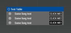
CT_CONTROLS_TABLE control.

Related commands & functions
Related User Interface Eventhandlers
Alphabetical Order
#define CT_CONTROLS_TABLE 19
F
firstIDC
- Type
- Numer
- Description
- The start IDC.
firstIDC = 9000;
H
headerHeight
Number example:
headerHeight = 0.025;
String example:
headerHeight = "5 * 0.5 * pixelGrid * pixeH";
HeaderTemplate
- Type
- Class
- Description
- Template for headers (unlike rows, cannot be selected).
class HeaderTemplate
{
	class HeaderBackground
	{
		controlBaseClassPath[] = { "RscText" };
		columnX = 0;
		columnW = 14.7 * GUI_GRID_W;
		controlOffsetY = 0;
	};
	class Column1
	{
		controlBaseClassPath[] = { "RscPictureKeepAspect" };
		columnX = 0.2 * GUI_GRID_W;
		columnW = 0.6 * GUI_GRID_W;
		controlOffsetY = 0.2 * GUI_GRID_H;
		controlH = 0.6 * GUI_GRID_H;
	};
	class Column2
	{
		controlBaseClassPath[] = { "RscText" };
		columnX = 0.8 * GUI_GRID_W;
		columnW = 9 * GUI_GRID_W;
		controlOffsetY = 0.1 * GUI_GRID_H;
	};
};
L
lastIDC
- Type
- Numer
- Description
- The last IDC.
lastIDC = 9999;
lineSpacing
Number example:
lineSpacing = 0.1;
String example:
lineSpacing = "1 * 0.5 * pixelGrid * pixelH";
R
rowHeight
Number example:
rowHeight = 0.025;
String example:
rowHeight = "5 * 0.5 * pixelGrid * pixeH";
RowTemplate
- Type
- Class
- Description
- Template for selectable rows.
class RowTemplate
{
	class RowBackground
	{
		controlBaseClassPath[] = { "RscText" };
		columnX = 0;
		columnW = 14.7 * GUI_GRID_W;
		controlOffsetY = 0;
	};
	class Column1
	{
		controlBaseClassPath[] = { "RscPictureKeepAspect" };
		columnX = 0;
		columnW = 2 * GUI_GRID_W;
		controlOffsetY = 0;
		controlH = 1 * GUI_GRID_H;
	};
	class Column2
	{
		controlBaseClassPath[] = { "RscText" };
		columnX = 2 * GUI_GRID_W;
		columnW = 8.7 * GUI_GRID_W;
		controlOffsetY = 0.1 * GUI_GRID_H;
	};
	class Column3
	{
		controlBaseClassPath[] = { "RscButton" };
		columnX = 11.2 * GUI_GRID_W;
		columnW = 2 * GUI_GRID_W;
		controlOffsetY = 0.1 * GUI_GRID_H;
	};
};
S
selectedRowAnimLength
- Type
- Number
- Description
- Length of the animation cycle in seconds.
selectedRowAnimLength = 1.2;
selectedRowColorFrom
- Type
- Array
- Description
- Colours which are used for animation (i.e. change of colour) of the selected line.
selectedRowColorFrom[] = {1,1,1,1};
selectedRowColorTo
- Type
- Array
- Description
- Colours which are used for animation (i.e. change of colour) of the selected line.
selectedRowColorTo[] = {1,1,1,0};
Default Classes
class MyControlsTable
{
	idc = 107;
	x = SafezoneX + 16.5 * GUI_GRID_W;
	y = SafezoneY + 3.5 * GUI_GRID_H;
	w = 15 * GUI_GRID_W;
	h = 20 * GUI_GRID_H;

	type = CT_CONTROLS_TABLE;
	style = SL_TEXTURES;

	lineSpacing = 0;
	rowHeight = 1 * GUI_GRID_H;
	headerHeight = 1 * GUI_GRID_H;

	firstIDC = 42000;
	lastIDC = 44999;

	// Colours which are used for animation (i.e. change of colour) of the selected line.
	selectedRowColorFrom[]  = { 0.7, 0.85, 1, 0.25 };
	selectedRowColorTo[]	= { 0.7, 0.85, 1, 0.5 };
	// Length of the animation cycle in seconds.
	selectedRowAnimLength = 1.2;

	class VScrollBar : ScrollBar
	{
		width = 0.021;
		autoScrollEnabled = 0;
		autoScrollDelay = 1;
		autoScrollRewind = 1;
		autoScrollSpeed = 1;
	};

	class HScrollBar : ScrollBar
	{
		height = 0.028;
	};

	// Template for selectable rows
	class RowTemplate
	{
		class RowBackground
		{
			controlBaseClassPath[] = { "RscText" };
			columnX = 0;
			columnW = 14.7 * GUI_GRID_W;
			controlOffsetY = 0;
		};
		class Column1
		{
			controlBaseClassPath[] = { "RscPictureKeepAspect" };
			columnX = 0;
			columnW = 2 * GUI_GRID_W;
			controlOffsetY = 0;
			controlH = 1 * GUI_GRID_H;
		};
		class Column2
		{
			controlBaseClassPath[] = { "RscText" };
			columnX = 2 * GUI_GRID_W;
			columnW = 8.7 * GUI_GRID_W;
			controlOffsetY = 0.1 * GUI_GRID_H;
		};
		class Column3
		{
			controlBaseClassPath[] = { "RscButton" };
			columnX = 11.2 * GUI_GRID_W;
			columnW = 2 * GUI_GRID_W;
			controlOffsetY = 0.1 * GUI_GRID_H;
		};
	};

	// Template for headers (unlike rows, cannot be selected)
	class HeaderTemplate
	{
		class HeaderBackground
		{
			controlBaseClassPath[] = { "RscText" };
			columnX = 0;
			columnW = 14.7 * GUI_GRID_W;
			controlOffsetY = 0;
		};
		class Column1
		{
			controlBaseClassPath[] = { "RscPictureKeepAspect" };
			columnX = 0.2 * GUI_GRID_W;
			columnW = 0.6 * GUI_GRID_W;
			controlOffsetY = 0.2 * GUI_GRID_H;
			controlH = 0.6 * GUI_GRID_H;
		};
		class Column2
		{
			controlBaseClassPath[] = { "RscText" };
			columnX = 0.8 * GUI_GRID_W;
			columnW = 9 * GUI_GRID_W;
			controlOffsetY = 0.1 * GUI_GRID_H;
		};
	};
};