CT_STATIC
| Control Types / MACRO (TYPE VALUE) | |
|---|---|
| Text/Image/Video |
CT_STATIC (0) | CT_EDIT (2) | CT_HTML (9) | CT_STRUCTURED_TEXT (13) |
| Buttons |
CT_BUTTON (1) | CT_ACTIVETEXT (11) | CT_SHORTCUTBUTTON (16) | CT_CHECKBOX (77) | CT_XBUTTON (41) |
| Lists |
CT_COMBO (4) | CT_TOOLBOX (6) | CT_CHECKBOXES (7) | CT_TREE (12) | CT_CONTROLS_TABLE (19) | CT_XCOMBO (44) | CT_LISTBOX (5) | CT_LISTNBOX (102) | CT_LISTNBOX_CHECKABLE (104) | CT_XLISTBOX (45) |
| 3D Objects |
CT_OBJECT (80) | CT_OBJECT_ZOOM (81) | CT_OBJECT_CONTAINER (82) | CT_OBJECT_CONT_ANIM (83) |
| Maps |
CT_MAP (100) | CT_MAP_MAIN (101) |
| Meta |
CT_SLIDER (3) | CT_XSLIDER (43) | CT_PROGRESS (8) | CT_CONTROLS_GROUP (15) | CT_WEBBROWSER (106) | CT_EXTENSION (107) |
| Menu |
CT_CONTEXT_MENU (14) | CT_MENU (46) | CT_MENU_STRIP (47) |
| Unknown |
CT_STATIC_SKEW (10) | CT_HITZONES (17) | CT_VEHICLETOGGLES (18) | CT_XKEYDESC (40) | CT_ANIMATED_TEXTURE (45) | CT_LINEBREAK (98) | CT_USER (99) | CT_ITEMSLOT (103) | CT_VEHICLE_DIRECTION (105) |
Introduction
Static controls represent exactly that: static data. Static means there is NO possible user interaction. CT_STATIC is primarily used for texts, dialog backgrounds, pictures (and videos). The constant type property for these controls usually is CT_STATIC.
Related commands & functions
Related User Interface Eventhandlers
Alphabetical Order
#define CT_STATIC 0
A
align
- Type
- String
- Description
- Alignment of text. Values can be "left", "center" or "right". Seems to have no effect. Use ST_LEFT/ST_CENTER/ST_RIGHT instead.
align = "center";
angle
- Type
- Number
- Description
- Rotation of the image. See ctrlSetAngle.
angle = 180;
autoplay
- Type
- Number
- Description
- Used on video controls. 1 means that the video starts playing as soon as the UI is opened.
autoplay = 0;
B
background
- Type
- Number
- Description
- n/a
background = 1;
C
centerU
- Type
- Number
- Description
- Sets the horizontal center for the rotation of images with ST_PICTURE controls. 0 is left border of the control, 1 is right border. See also: ctrlSetAngle.
centerU = 0.5;
centerV
- Type
- Number
- Description
- Sets the vertical center for the rotation of images with ST_PICTURE controls. 0 is top border of the control, 1 is bottom border. See also: ctrlSetAngle.
centerV = 0.5;
color
- Type
- Array
- Description
- Most likely without function.
color[] = {1,1,1,1};
colorActive
- Type
- Array
- Description
- Not applicable for this type as it can not be active.
colorActive[] = {0.23,0.35,0.42,0.9};
colorShadow
- Type
- Array
- Description
- Color of the shadow of the text.
colorShadow[] = {0,0,0,1};
F
fixedWidth
- Type
- Number
- Description
- Makes normal text like "LALALA" appear like "L A L A L A".
fixedWidth = 0;
L
lines
- Type
- Number
- Description
- n/a
lines = 3;
lineSpacing
- Type
- Number
- Description
- Space between lines, required if the style was set to ST_MULTI.
lineSpacing = 0;
loops
- Type
- Number
- Description
- Defines how many times video will be restarted.
loops = 0;
S
sortDown
- Type
- String
- Description
- n/a
sortDown = "\a3\ui_f\data\gui\rsc\rscdisplaymultiplayer\arrow_down_ca.paa";
sortUp
- Type
- String
- Description
- n/a
sortUp = "\a3\ui_f\data\gui\rsc\rscdisplaymultiplayer\arrow_up_ca.paa";
T
tileH
- Type
- Number, String
- Description
- Height of one tile. Used with ST_TILE_PICTURE to create a repeating wall of pictures, such as the fullscreen backgrounds in the Eden Editor. Uses GUI Coordinates.
Number example:
tileH = 1;
String example:
tileH = "4 / (32 * pixelH)";
tileW
- Type
- Number, String
- Description
- Width of one tile. Used with ST_TILE_PICTURE to create a repeating wall of pictures, such as the fullscreen backgrounds in the Eden Editor. Uses GUI Coordinates.
Number example:
tileW = 1;
String example:
tileW = "8 / (32 * pixelW)";
W
widgetLineWidth
- Type
- Number
- Description
- n/a
widgetLineWidth = 10;
Default Classes
RscText
Most often this type of control will be used to add text to dialogs. If you want the text to change dynamically while playing the mission, you should set the idc property to a positive number, which allows usage of the ctrlSetText function. Text alignment can be controlled using the style property and the ST_* constants.
By default, this will only display a single line (and cut the overflow); use ST_MULTI if you intend to use multiple lines. This also requires setting the property lineSpacing, which indicates the relative space between lines; usually, you can set this to 1 for normal line spacing.
class RscText
{
	deletable = 0;
	fade = 0;
	access = 0;
	type = CT_STATIC;
	idc = -1;
	colorBackground[] = {0,0,0,0};
	colorText[] = {1,1,1,1};
	text = "";
	fixedWidth = 0;
	x = 0;
	y = 0;
	h = 0.037;
	w = 0.3;
	style = ST_LEFT;
	shadow = 1;
	colorShadow[] = {0,0,0,0.5};
	font = "RobotoCondensed";
	SizeEx = GUI_TEXT_SIZE_MEDIUM;
	linespacing = 1;
	tooltipColorText[] = {1,1,1,1};
	tooltipColorBox[] = {1,1,1,1};
	tooltipColorShade[] = {0,0,0,0.65};
};
Trivia
When an RscText control with IDC 101 is added to the map, it displays the current time.
RscLine
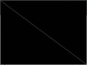
Draws a single line from top left to bottom right corner of the control.
class RscLine : RscText
{
	idc = -1;
	style = ST_MULTI + ST_TITLE_BAR + ST_HUD_BACKGROUND;
	x = 0.17;
	y = 0.48;
	w = 0.66;
	h = 0;
	text = "";
	colorBackground[] = {0,0,0,0};
	colorText[] = {1,1,1,1};
};
RscFrame
Frame that outlines the control's borders. When text is set it appears on the top line to the left.
class RscFrame
{
	type = CT_STATIC;
	idc = -1;
	deletable = 0;
	style = ST_FRAME;
	shadow = 2;
	colorBackground[] = {0,0,0,0};
	colorText[] = {1,1,1,1};
	font = "RobotoCondensed";
	sizeEx = 0.02;
	text = "";
	x = 0;
	y = 0;
	w = 0.3;
	h = 0.3;
};
RscPicture
Using specific style constants you can enhance your dialogs with pictures too. These pictures should reside in your mission folder as paa-files. Then set your style property to ST_PICTURE (to display it once) or ST_TILE_PICTURE (to tile it) and use the text property to locate the paa image you want to use, relative to your addon or mission folder (absolute paths should not be used).
class RscPicture
{
	deletable = 0;
	fade = 0;
	access = 0;
	type = CT_STATIC;
	idc = -1;
	style = ST_MULTI + ST_TITLE_BAR;
	colorBackground[] = {0,0,0,0};
	colorText[] = {1,1,1,1};
	font = "TahomaB";
	sizeEx = 0;
	lineSpacing = 0;
	text = "";
	fixedWidth = 0;
	shadow = 0;
	x = 0;
	y = 0;
	w = 0.2;
	h = 0.15;
	tooltipColorText[] = {1,1,1,1};
	tooltipColorBox[] = {1,1,1,1};
	tooltipColorShade[] = {0,0,0,0.65};
};
RscPictureKeepAspect
Same as RscPicture, but keeps the image the same ratio as in the source file.
class RscPictureKeepAspect : RscPicture
{
	style = ST_MULTI + ST_TITLE_BAR + ST_KEEP_ASPECT_RATIO;
};
RscVideo
All settings are same as for pictures, only source file must be of .OGV format. Two additional properties are available - autoplay (when 1, video starts automatically) and loops (defines how many times video will be played in loop).
For video encoding, you can use:
class RscVideo : RscPicture
{
	autoplay = 1;
	loops = 1;
};
Other Classes
Static background
One can also use this control type to add solid background to dialogs by simply leaving the text property empty. This way, it will look like a regular rectangle.
class MyRedBackgroundExample
{
  /* ... same as the text example, except for */
  colorBackground[] = { 1, 0.1, 0.1, 0.8 };
  text = "";
};


